In the two previous blog posts, I have analysed two film trailers of Mama and The possession so within this blog post I am going to be looking the film posters for these two trailers.
Mama

- The poster has the name of a celebrity above the title to catch the audiences eye making the audience want to watch the film because that actor is in it
- The posters colour scheme is quite dull with blacks, browns and whites which is not quite typical as a horror film (Most horror films have colours red on it that represents blood or danger)
- The film also advertises another film by the same director "Presented by Guillermo del Toro creator of Pans Labryrinth" encourages the audience to go see both films and as it says the name of the director this can persuade the audience to watch it especially if the director has a good reputation
- The main image is of a young girl which is a typical protaganist as a horror film because she is weak and innocent and vulnerable
- The title "Mama" is quite simple and plain that works well with black and brown background colour
- There are pictures of butterflies that shows that they are quite important in the plot
- No release date so suggests its a teaser poster and not the official film poster
 |
| Big name celebrity "Jessica Chastain"/Title "MAMA"/Tagline "A MOTHER'S LOVE IS FOREVER" |
The Possession
- Headline at the top is "BASED ON A TRUE STORY" which is used to potentially scare and show a sense of anticipation as it would make the film seem more creepier
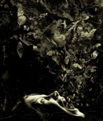
- The main image is a focus of the main protaganist which is a young which is stereotypical of a horror film as the character is seen as quite innocent and vulnerable
- The colour scheme is quite dull which gives it a more scary feel to it
- The butterflies are the main focus in the image as it juxtaposes between the genre being a horror and the fact that butterflies are supposed to be quite innocent and harmless
- The tagline "FEAR THE DEMON THAT DOESN'T FEAR GOD" is put underneath the title to attract the audience
- The release date is also shown in a medium sized font so it doesn't distract from the title being the main focus but it allows the date to be noticable
 |
| The release date |
 |
| The main image shows a girl screaming out butterflies creates an image of mystery and suspense for the audience as you dont really know what is going to happen |
 |
| The tagline |
 |
| The title |


No comments:
Post a Comment