Monday, 26 March 2018

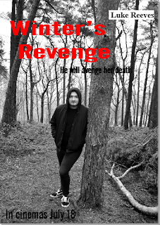
Organisation: Features of my film poster

There are many codes and conventions that need to be included in a film poster to make it look more realistic and like a professional film poster. 


The features of my film poster:

1.) This is the title and tagline.
This is the same as on the film magazine.
This shows a sense of cohesion.

2.) This is the credit box.

3.) This shows who the film is made by

4.) This is a website link
which makes it seem more
professional and realistic
5.) This is the release date
of the film 


Organisation: Features of my magazine


There are many codes and conventions that need to be included in a film magazine to make it look more realistic and like a professional film magazine. 

This is the magazine that I have completed.
The features of my magazine are:
1.) This is the masthead of a popular and well known film magazine so it
seems more realistic as it is a completely real brand.
Also, by using a well known brand you can emulate the magazine
and you know how some magazines are made.
2.) This is the date line and price of the magazine.
By putting this on the magazine,
it makes it seem more realistic.

3.) This is an added cover line at the bottom of the page
to give extra information
4.) The bar code is used as a main convention
 for when the magazine is sold
5.) This is the name of my film and the tagline.
They follow a similar house colour of black and red
to relate to the horror and gore portrayed in my horror theme.
This would be similar to the one on the film poster
to give cohesion between the products
6.) This is a pug.

7.) These are a list of cover lines
included in the film magazine. They are quite similar to my genre
of film as they are mostly horror or mystery
8.) Website link - make it more realistic


Organisation: Film Masthead

I have decided to create a film magazine using the Empire Magazine layout. The red colour of the masthead goes with the house colour theme of red and black to portray the horror theme. This is placed in the left third as normal. The other things placed in the left third is cover lines and a pug. The Empire magazine is a popular magazine and is used for basically any genre of film. The film magazine that I used to get influence from was 'The Hunger Game' Empire magazine.

This is 
90

Friday, 23 March 2018

Research into target audience: Feedback for both posters

These are my two draft posters. I have used a portrait and landscape poster. The posters contain several normal codes and conventions of a film poster - name, tagline, cast members, release date and credit box. 


I am going to be asking some friends which poster out of these two that they prefer and why.


From my research, It seems that everyone mostly prefers the second film poster for various reasons so I think this will be the best film poster because it links with the film trailer as the poster includes the main motif of a clock.

Thursday, 22 March 2018

Drafting and Planning: Draft Posters

I have created two draft posters for my ancillary product that follow a sort of similar style as they both have the same main cover as it is my antagonist. In the first draft poster, it shows that the clock is a main motif in the film trailer whereas the second draft poster focuses more on where the film trailer is set in a forest. Personally, I prefer my first draft poster. I am going to be asking what my friends think about both and which they prefer and why.


Tuesday, 20 March 2018

Research into similar products: film magazine

For the second ancillary product, we have to create a film magazine. Empire is one of the main film magazines available. It is very common and easy to recognise.

The features of a film magazine:


  • House colour scheme - in this magazine, the house colour scheme is red, black and white. These both represent the film and Empire as a whole magazine. The red colour of the Empire is the normal masthead but it also represents the fire from the film. The black colour of the magazine matches the outfir Katniss wears in the film.
  • Masthead - this is at the top and is in the same place as usual. Some magazines have it placed on the left third 
  • Main cover line - this is the largest one and is placed right next to the main cover star
  • Main cover star - uses direct address to attract the audience 
  • Date, price line, bar code
  • Cover lines - placed around the main cover star
  • Secondary cover star 
  • Puff - at the top of the magazine and attracts the audience

Friday, 16 March 2018

Drafting and Planning: Photoshoot photos


On the 11th of March, me and my main antagonist actor Luke went to the lickies for a photoshoot for my ancillary products. Here are the photos that I took: 


Tuesday, 13 March 2018

Organisation: photoshoot date

My anciliary products are a film poster and film magazine. For this I have decided to do a Photoshoot with my main character played by Luke Reeves up at the lickey hills on Sunday 11th March. The weather is looking good for that day and both me and Luke are available to go this day.

Sunday, 11 March 2018

Drafting and Planning: Draftng Poster ideas

Along with my film trailer, I have to create two ancillary products of a film magazine front cover and a film poster for my film trailer. In this blog post, I am going to be looking at ideas for my film poster. Due to the clock playing a heavy part in my film trailer and a motif in my film, I want it to play a big part in my film poster too. Through looking at many different film posters I have also decided that I want the main antagonist to be on my film poster.

The film poster I am going to be using as an influence is:

The Nightmare On Elm Street

I like this poster because it uses the main antagonist as a main feature for the film poster in a medium shot. The camera is dark to emphasis that he is an evil and dark character. Furthermore, the main motif in the film Nightmare on elm street is the knives as fingers.

In my own poster, I want a medium shot of my main antagonist Logan (played by Luke). My character will be wearing like black clothes like he does in the film trailer. The background will be quite dark to show that he is the evil one. The main motif is the alarm clock so he will be holding the alarm clock and the writing will be over the top of the clock.


Another film poster I took influence from was:

The Forest


I like this poster as it is black and white which makes it stand out. I also like it because it is in a forest similar to my forest in my film trailer

Friday, 9 March 2018

Research into Target Audience: First Draft Feedback from my teacher - Winters Revenge

As I said in a previous blog post, this lesson I received my feedback from my teacher on our first draft. When I sat down with my teacher, I was able to see what my trailer looked like as a whole whilst receiving good and bad points of my trailer and where I could improve and go forward to complete my trailer to its best possible outcome.

My teacher offered me some suggestions for improvements:


  • Add some more intro intertitles - at the moment I have one important intertitle of "Her death will be avenged" so more are needed
  • My teacher also said that there wasn't a lot to go on at present due to a lack of footage and narrative
  • Music could be added to allow tension to be built up - my teacher even suggested that I blocked out some of the ambient noise and add music to create a bigger impact on the audience. In the fifth scene, he suggested that I block out the sound on one clip until it gets to charlie saying "OW!" then the sound going off again so that one word stands out
  • My teacher also questioned the purpose of the alarm clock at the end but it is to symbolise a countdown to the next victim and this corresponds to the intertitles of "1", "2" and "3"
  • Add in credits at the end of the trailer using the black swan example


This shows that my teacher was quite helpful in giving ideas to make my film trailer the best. I knew my credits needed sorting out and more music was needed and I needed to complete my film trailer. Overall, I am pleased with the feedback of my film trailer and I now know where I can improve.

My teacher also gave me some good points to let me know that I am truly on the right tracks of my film trailer.

The good points of my trailer are:


  • My teacher said that overall he got my film trailer in terms of the technical codes
  • He also said that my editing in scene four was good as it has gaps in between to show a build up of tension throughout the scenes

Tuesday, 6 March 2018

Organisation: Camera


The camera that I have been using is my friend Caitlyn's camera which is a Canon EOS M3 and I have been using a tripod from school so the camera could be put on the floor and pointed upwards to show dominance and fear and you can look down on the character to show their fear. I also used the tripod to keep it still as it was easier to hold this instead of the camera.
The camera is really good quality and very easy to use. It has a flip screen like so to be able to use it to do a POV shot which meant I could do a variety of shots even if they didn't all make it into my film trailer. The clip above is a scene that didn't make it into my trailer but shows a different shot type.


Sunday, 4 March 2018

Drafting and Planning: First Draft - My thoughts

The week before half term (15th February), Me and my class handed in our first draft of our products weather it be a film trailer, like mine, music video or a regional magazine.This meant that we still had time to complete our products and see where we are at the moment, as well as find out what we need to do to make our products the best they can be before our final deadline. This also gave us an oppurtunity to see our products as a whole as this was the first time I could saw my whole trailer pieced together with the intertitles which are the sections in between. This allowed me to see the improvements I needed to make and the parts I am missing. I unfortunately have not be able to finish my film trailer so I have filmed 3 out of a possible 6 scenes. By taking time to evaluate my own work, I can see where both me and my teacher agree on where I need to improve and change my work when it has been marked.

My own personal thoughts for improvement:


  • Due to weather delays, camera and character availability, my film trailer was incomplete as I am missing 3 out of 6 scenes. This is an important thing that I need to improve so I can complete and hand in a full version of my film trailer and to see if it makes sense and you can depict the storyline. As well to see if it links well and looks good the whole way through. 

  • I think I need to do more editing on the 4th scene of Ben and Luke in the Alleyway as part of the scene you can see Luke even though he isn't meant to be there

  • Also in Scene four, Luke, even though he is the main character, he isnt in the scene for very long

  • Scene four also doesnt follow the script as Ben doesnt say anything or call a meeting on his phone to show that he is the boss.
I may need to re-shoot scene four fixing all this little details but I wont know exactly what I need to know until I get my own feedback from my teacher in the next couple of days.


Friday, 2 March 2018

Research into similar products: film poster

In this blog post, I have decided that I am going to analysis the film poster of 'A Nightmare on Elm Street'. The genre of this film is slasher, horror and thriller as it is about a group of teenagers in American getting killed by a disfigured midnight mangler named freddy Krueger in their dreams then reality.


  • The main focus of the film poster is Freddy Kruger himself as he is the main antagonist of the film. This will attract an audience because he is a well known villian.

  • The lighting of the film poster is quite dark which helps portray the genre of the film to be a horror.

  • The title of the film 'A nightmare on elm street' uses the biggest text in the frame to emphasis the name and make people want to remember it to watch.

  • The title name is written is red so it stands out but it could also link to the blood, gore and violence that is going to happen in the film

  • The tagline "welcome to your nightmares" is also written in white font just above the title to make it stand out and attract the audience 

  • Institutional information is written in the block of writing at the bottom of the poster

  • The release date of 04. 30. 10 is write in bigger letters at the bottom of the poster in red font so that it stsnds out and audiences know exactly when the film is being released 

  • In the main image of Freddy Kruger, you can clearly see the knives as fingers on the main antagonist which emphasises the slasher genre of the film 

My Evaluation

Evaluation from ChloeKiely2