Evaluation from ChloeKiely2
Chloe Kiely A2
Monday, 9 April 2018
Friday, 6 April 2018
Wednesday, 4 April 2018
Drafting and Planning: intertitles
Intertitles are used throughout a film trailer to break up scenes. These can include the name of the film and other information about the film like a release date. When I handed in my first draft of my film trailer, I found out that I needed more intertitles as I hadn't finished the whole of my trailer but the ones I already had were good. Intertitles can also make a film trailers narrative make more sense and further develop the storyline for the audience.
In my intertitles, I wanted to create suspense and tension so I placed them in between each scene. I also wanted to use intertitles that gave very little information which would lead the audience wanting to know more.
In my intertitles, I wanted to create suspense and tension so I placed them in between each scene. I also wanted to use intertitles that gave very little information which would lead the audience wanting to know more.
Monday, 26 March 2018
Organisation: Features of my film poster
There are many codes and conventions that need to be included in a film poster to make it look more realistic and like a professional film poster.
The features of my film poster:
 |
| 1.) This is the title and tagline. This is the same as on the film magazine. This shows a sense of cohesion. |
| 2.) This is the credit box. |
 |
| 3.) This shows who the film is made by |
 |
| 4.) This is a website link which makes it seem more professional and realistic |
 |
| 5.) This is the release date of the film |
Organisation: Features of my magazine
There are many codes and conventions that need to be included in a film magazine to make it look more realistic and like a professional film magazine.
 |
| This is the magazine that I have completed. |
The features of my magazine are:
 |
| 2.) This is the date line and price of the magazine. By putting this on the magazine, it makes it seem more realistic. |
 |
| 3.) This is an added cover line at the bottom of the page to give extra information |
 |
| 4.) The bar code is used as a main convention for when the magazine is sold |
 |
| 6.) This is a pug. |
 |
| 7.) These are a list of cover lines included in the film magazine. They are quite similar to my genre of film as they are mostly horror or mystery 8.) Website link - make it more realistic |
Organisation: Film Masthead
I have decided to create a film magazine using the Empire Magazine layout. The red colour of the masthead goes with the house colour theme of red and black to portray the horror theme. This is placed in the left third as normal. The other things placed in the left third is cover lines and a pug. The Empire magazine is a popular magazine and is used for basically any genre of film. The film magazine that I used to get influence from was 'The Hunger Game' Empire magazine.
 |
| This is |
Friday, 23 March 2018
Research into target audience: Feedback for both posters
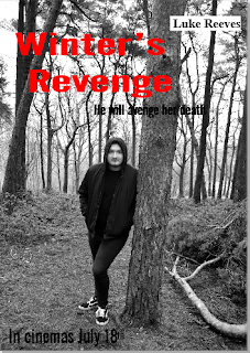
These are my two draft posters. I have used a portrait and landscape poster. The posters contain several normal codes and conventions of a film poster - name, tagline, cast members, release date and credit box.
I am going to be asking some friends which poster out of these two that they prefer and why.
From my research, It seems that everyone mostly prefers the second film poster for various reasons so I think this will be the best film poster because it links with the film trailer as the poster includes the main motif of a clock.
Subscribe to:
Comments (Atom)
My Evaluation
Evaluation from ChloeKiely2
-
There are many codes and conventions that need to be included in a film magazine to make it look more realistic and like a professional fi...
-
As well as the moving image product that we will have to create, we have to create two ancillary products which are a film poster and front ...
-
I have decided to do a serial killer storyline in my film trailer so I have decided to look into real films that are around the same topic a...


